

5. Content Blocks
Organize your content into one of the various content block styles to make your content easy for your user to read. View the demo page for a preview of the various elements.
A how-to guide and helpful information about configuration and options.
BeTheme HTML is the new era of building websites. A large variety of layout and content options are available.
Below are directions and example code for the various elements of the BeTheme HTML template.
Does your BeTheme download look incomplete? Try using either WinRAR or http://www.7-zip.org to open the zip!

After you download your website template from ThemeForest and make all of your edits you're going to need to upload the files to your web server. You will need an FTP client such as Dreamweaver or FileZilla. In your FTP client add your server details (get this from your web host provider) and then you can connect to your server and upload your files.
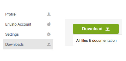
When an update is available in the future you will need to re-download the package from ThemeForest. While logged into your account at ThemeForest hover over your name in the top right of the screen and click Downloads. From here Download > All files button next to BeTheme item and save the package on your computer.
The BeTheme HTML template is a responsive website template with a lot of layout options. See below for details on how files are organized.
CSS files are loaded into the head of the website pages. This is where you will find the CSS files for website layouts, colors and styles. The CSS files are located in the css folders.
The global.css file has CSS used on every layout, including the default homepage and pages and the extra custom demos. The structure.css file contains the main structure for each layout/demo. The next CSS file is usually named after the name of the demo (adagency.css in the example below) and contains demo specific CSS. The custom.css file is a blank CSS file where you can put your custom CSS to override the templates CSS.
Default layout CSS:
"Demos" CSS:
Bootstrap responsive utilities
BeTheme HTML has the Bootstrap responsive utility CSS styles in the global.css styles so you can show and hide elements at different screen widths. The print styles are also included. For more info on the Boostrap utility CSS go here. To be clear, BeTheme HTML uses a custom responsive grid, not the Bootstrap gird, we have included the responsive utility styles since these can work on their own and some people have made this request.
On Scroll Animation Effects
To add an effect to an HTML element on scroll add the CSS class "animate" to the element as well as data-anim-type="zoomInLeftLarge" but change that effect to whichever you like, the options are:
Example:
Content here..
Javascript files are loaded at the end of the document to help with page load time. Most scripts are combined into the plugins file and are initiated in the scripts file.
The Javascript files are located in the js folder.
In the root of the website you will find the main theme files. In update version 3.8 we added new main theme files, these files are located in the "theme" folder. We decided to keep both versions so you can use whichever you desire. If you are not interested in using the new files you can delete the "theme" folder.
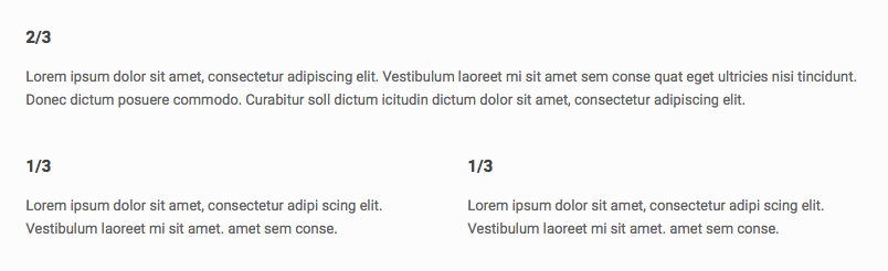
Pages are made up of rows with columns. CSS classes on the column DIVs control the width of the column. You can view example column layouts on the typography page.
CSS options for controlling the widths of the columns include:
	3/4
	Lorem ipsum dolor sit amet, consectetur adipiscing elit. Vestibulum laoreet mi sit amet sem consequat eget ultricies nisi tincidunt. Donec dictum posuere commodo. Curabitur sollicitudin dictum urna quis molestie. Proin eget massa quis lorem hendrerit consequat interdum eget.
BeTheme offers multiple header layout options. Visit the header section for full details.
Logo
Add your logo image:
You should also create a logo twice as large as your original logo for retina screens. Make sure to link to the path of the retina logo:
Favicons & Apple touch icons
You can create a custom favicon and replace it in the images folder. You can also create Apple touch icons for when people bookmark your site on a mobile device. There are a few different sizes you should create so it looks great on retina screens. See where these are located here:
To edit the sliding top widget area you can add your content to the 4 columns as seen below. You could also change the amount of columns to make a different layout.
For a sticky header add the CSS classes sticky-header and header-sticky to the body tag on your page.
If you create a one page website or just want to use links with hashtags on one page, you need to create links with hashtags "#". For example if your website is http://website.com a link on the same page would look like http://website.com/#section1
If you want to have the smooth scrool effect for those menu items, you need to setup correct CSS Classes for each menu item which should have this effect. To do that, in your main menu type scroll add a CSS class on the li elements that need it.
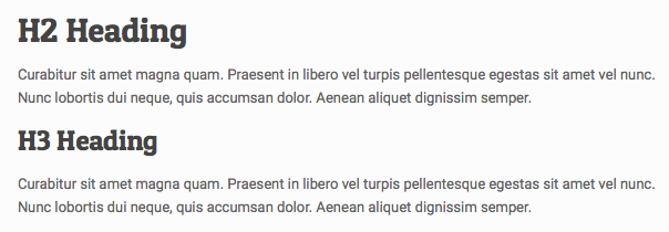
To preview the BeTheme typography you can visit the typography page, where you can easily view the source code to copy and use the correct HTML elements (see below for more details).
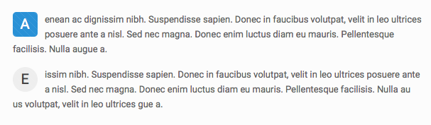
Example dropcap:
	 A
enean ac dignissim nibh. Suspendisse sapien. Donec in faucibus volutpat, velit in leo ultrices posuere ante a nisl. Sed nec magna. Donec enim luctus diam eu mauris. Pellentesque facilisis. Nulla augue a.


	 E
issim nibh. Suspendisse sapien. Donec in faucibus volutpat, velit in leo ultrices posuere ante a nisl. Sed nec magna. Donec enim luctus diam eu mauris. Pellentesque facilisis. Nulla au us volutpat, velit in leo ultrices gue a.
Example highlight:
Pellentesque suspendisse sapien tristique commodo. Suspendisse vitae lectus varius quis, tellus.Donec ullamcorper in, dapibus quam
hendrerit eget, bibendum a bibendum tempus. Pellentesque ac ipsum. Vestibulum non sem. Mauris purus.
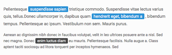
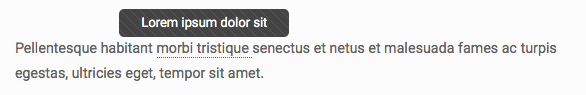
Example tooltip:
Pellentesque habitant morbi tristique senectus et netus et malesuada fames ac turpis egestas, ultricies eget, tempor sit amet.
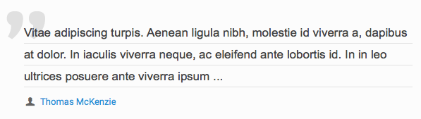
Example blockquote:
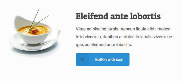
Vitae adipiscing turpis. Aenean ligula nibh, molestie id viverra a, dapibus at dolor. In iaculis viverra neque, ac eleifend ante lobortis id. In in leo ultrices posuere ante viverra ipsum ...
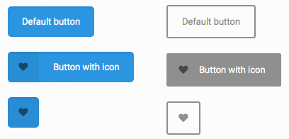
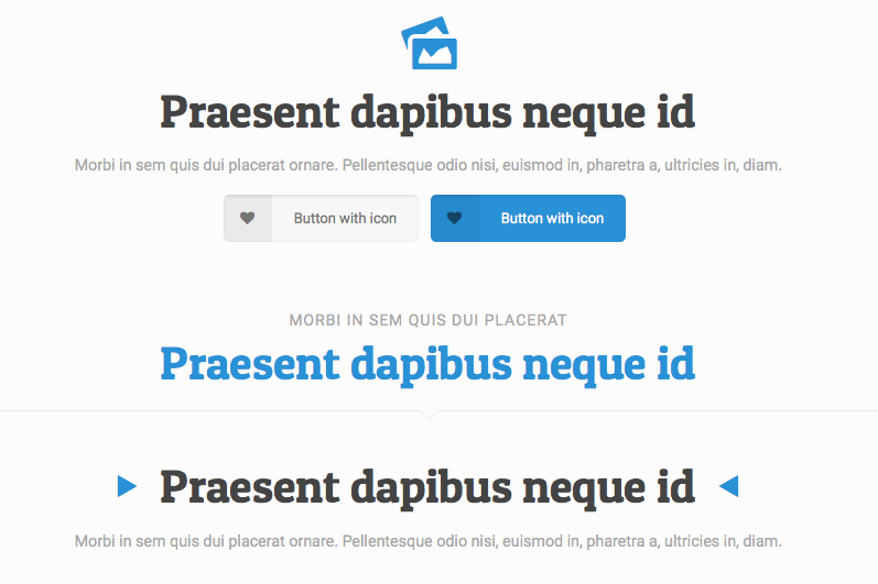
Buttons can be created with or without icons or text. 4 example buttons are below. You can add CSS classes to the buttons to choose which side the icon will be on, if it should be a large button and color. If you want to link the button to a section on the same page with the nice scroll effect you must enter the scroll class and if you want the button to open a link in an iframe use the prettyphoto class. Other CSS classes include button_large, button_left, button_right, button_red, button_blue, button_turquoise, button_yellow, button_grey, button_navy, button_orange , button_green. View the typography page to preview all options.
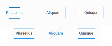
There are 8 different fancy link effects. Choose your effect by switching the CSS classs mfn-link-1.
	Phasellus


	Phasellus


	Phasellus


	Phasellus


	Phasellus


	Phasellus


	Phasellus


	Phasellus
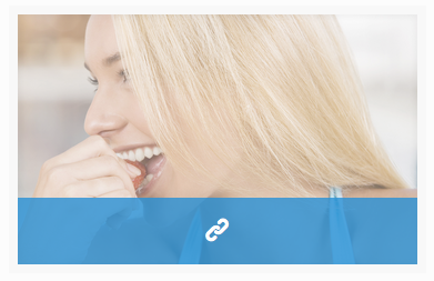
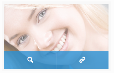
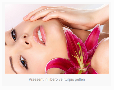
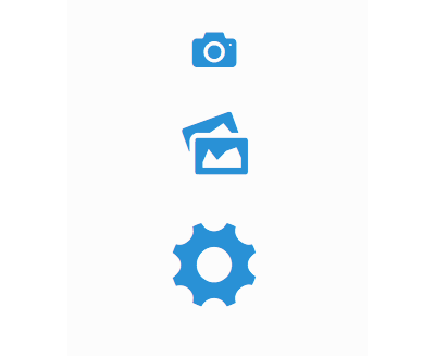
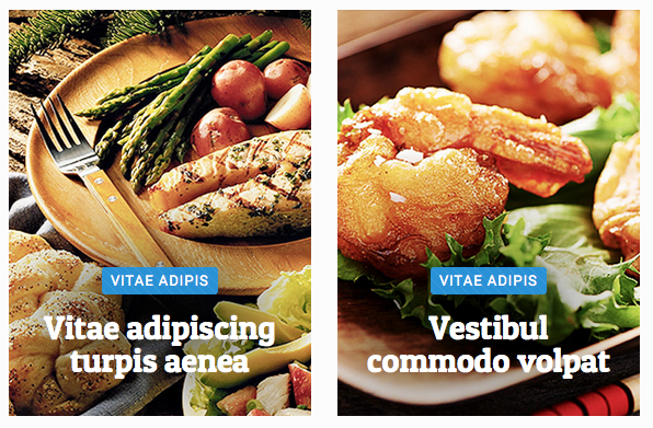
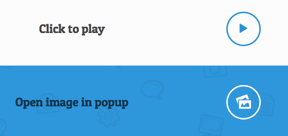
Below are a few examples of embedding an image on a page. You can have an overlay effect with a single icon on hover or 2 icons by using the double CSS class. The final example shows how to add caption text to an image.

Praesent in libero vel turpis pellen
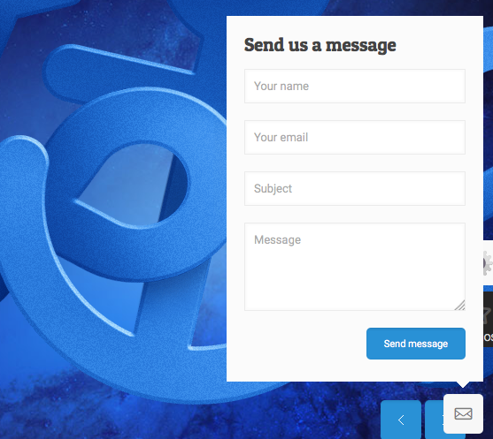
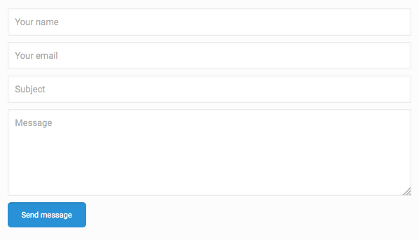
BeTheme has custom CSS for form elements to make sure all your forms look great.
To set the email address that you want the form to send to open /php/contactform.php and add your email address.
Example icon block:
Example dividers code below. You can choose from Default, Dots and ZigZag styles as well as Default, Narrow and Wide line styles.
If you choose a custom Google Font you will need to make sure to add the font to your CSS. First find your font on the Google Font website, copy the font you want to import and paste that into the head of your website.
Add to the head:
Then add to your CSS:
.example_class { font-family:'Pompiere',Arial,Tahoma,sans-serif }
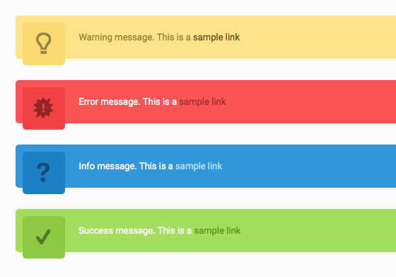
Example alerts:
Warning message. This is a sample linkError message. This is a sample linkInfo message. This is a sample linkSuccess message. This is a sample link
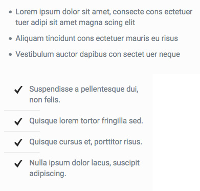
Aside from standard bulleted lists you can choose to use a custom list. Add the CSS class list_check, list_star or list_idea to the UL:
Icons can easily be added to a page:
You can then target these icons with CSS to add your custom styling.
View all availabe icons on the Typography page.
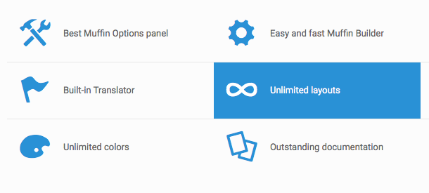
BeTheme has a lot of available boxes and infographic styles for you to use to customize the layout of your content on your site. See below for details, view the boxes & infographics page for previews.
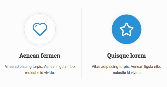
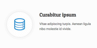
With this item you can create awesome looking Icon boxes with a nice hover effect.
Top icon:
Left icon:
Style with a nice sliding effect on hover.
With a hover box you need to set 2 image path, one for normal state and one for the hover state.
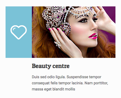
A photo box can be created like below, with or without a link.
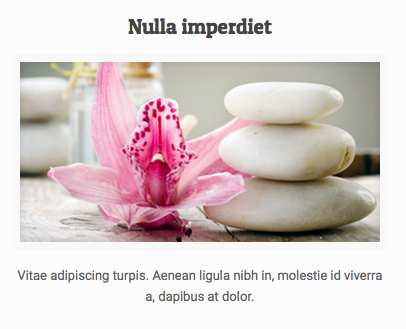
    Nulla imperdiet


        Vitae adipiscing turpis. Aenean ligula nibh in, molestie id viverra a,
        dapibus at dolor.
Choose if you want a left or right style promo box by switching the CSS class to either promo_box_left or promo_box_right.
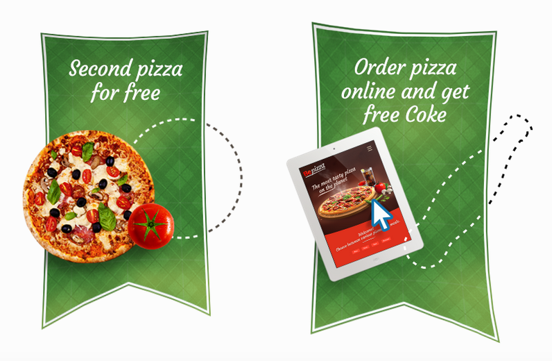
Trailer Boxes have a slogan, photo and a nice hover effect.
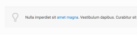
Example idea box:
Nulla imperdiet sit amet magna. Vestibulum dapibus. Curabitur sit amet magna quam. Praesent in libero vel turpis pellentesque egestas sit amet vel nunc.
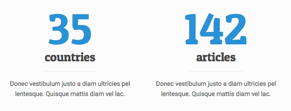
An item to present facts with short descriptions.
35countries
Donec vestibulum justo a diam ultricies pel lentesque. Quisque mattis diam vel lac.
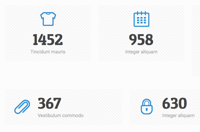
Counter
Create a counter with icons or images. Don't forget to set the data-to number.
1452Tincidunt mauris
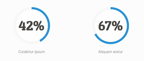
Chart
With this design make sure to set the data-percent to decide how much of the circle will be filled in.
42%Curabitur ipsum
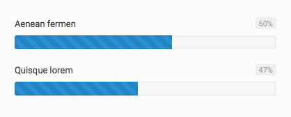
With a skills bar make sure to set the width of the progress span.
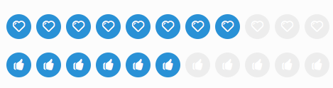
Example progress icons row with 8 active icons. Set the data-active setting to choose how many will be filled in.
Organize your content into one of the various content block styles to make your content easy for your user to read. View the demo page for a preview of the various elements.
You can create horizontal or vertical tabbed sections.
Horizontal tabs
Vertical tabs
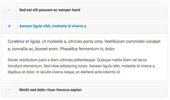
Example accordion:
Sed est elit posuere ac semper hendrerit nequeLorem ipsum dolor sit amet, consectetur adipiscing elit. Fusce velit tortor, dictum in gravida nec, aliquet non lorem.
Donec vestibulum justo a diam ultricies pellentesque. Quisque mattis diam vel lacus tincidunt elementum. Sed vitae adipiscing turpis. Aenean ligula nibh, molestie id viverra a, dapibus at dolor. In iaculis viverra neque, ac eleifend ante lobortis id. In viverra ipsum ac eros tristique dignissim. Donec aliquam velit vitae mi dictum.
Aenean ligula nibh, molestie id viverra aLorem ipsum dolor sit amet, consectetur adipiscing elit. Fusce velit tortor, dictum in gravida nec, aliquet non lorem.
Donec vestibulum justo a diam ultricies pellentesque. Quisque mattis diam vel lacus tincidunt elementum. Sed vitae adipiscing turpis. Aenean ligula nibh, molestie id viverra a, dapibus at dolor. In iaculis viverra neque, ac eleifend ante lobortis id. In viverra ipsum ac eros tristique dignissim. Donec aliquam velit vitae mi dictum.
Example toggle:
Sed est elit posuere ac semper hendrerit nequeLorem ipsum dolor sit amet, consectetur adipiscing elit. Fusce velit tortor, dictum in gravida nec, aliquet non lorem.
Donec vestibulum justo a diam ultricies pellentesque. Quisque mattis diam vel lacus tincidunt elementum. Sed vitae adipiscing turpis. Aenean ligula nibh, molestie id viverra a, dapibus at dolor. In iaculis viverra neque, ac eleifend ante lobortis id. In viverra ipsum ac eros tristique dignissim. Donec aliquam velit vitae mi dictum.
Aenean ligula nibh, molestie id viverra aLorem ipsum dolor sit amet, consectetur adipiscing elit. Fusce velit tortor, dictum in gravida nec, aliquet non lorem.
Donec vestibulum justo a diam ultricies pellentesque. Quisque mattis diam vel lacus tincidunt elementum. Sed vitae adipiscing turpis. Aenean ligula nibh, molestie id viverra a, dapibus at dolor. In iaculis viverra neque, ac eleifend ante lobortis id.
Example code for 2 different styles of table layouts.
Table style 1
| Employee | Salary | Bonus | Supervisor |
|---|---|---|---|
| Stephen C. Cox | $300 | $50 | Bob |
| Josephin Tan | $150 | - | Annie |
| Joyce Ming | $200 | $35 | Andy |
| James A. Pentel | $175 | $25 | Annie |
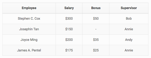
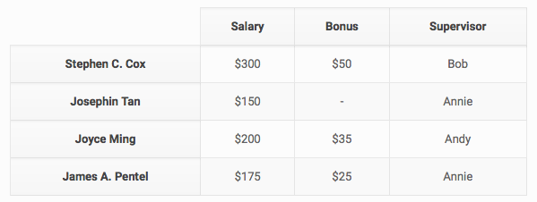
Table style 2
| Salary | Bonus | Supervisor | |
|---|---|---|---|
| Stephen C. Cox | $300 | $50 | Bob |
| Josephin Tan | $150 | - | Annie |
| Joyce Ming | $200 | $35 | Andy |
| James A. Pentel | $175 | $25 | Annie |
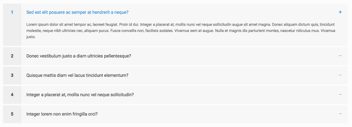
Easily create a faq page with the following code:
1Sed est elit posuere ac semper at hendrerit a neque?Lorem ipsum dolor sit amet tempor ac, laoreet feugiat. Proin id dui. Integer a placerat at, mollis nunc vel neque sollicitudin augue sit amet magna. Donec aliquam dictum quis, tincidunt molestie, neque nibh ultricies nec, aliquam purus. Fusce convallis non, facilisis sodales. Vivamus sem at augue. Nulla et magnis dis parturient montes, nascetur ridiculus mus. Vivamus justo.
2Donec vestibulum justo a diam ultricies pellentesque?Lorem ipsum dolor sit amet, consectetur adipiscing elit. Fusce velit tortor, dictum in gravida nec, aliquet non lorem.
Donec vestibulum justo a diam ultricies pellentesque. Quisque mattis diam vel lacus tincidunt elementum. Sed vitae adipiscing turpis. Aenean ligula nibh, molestie id viverra a, dapibus at dolor. In iaculis viverra neque, ac eleifend ante lobortis id. In viverra ipsum ac eros tristique dignissim. Donec aliquam velit vitae mi dictum.
3Quisque mattis diam vel lacus tincidunt elementum?Donec vestibulum justo a diam ultricies pellentesque. Quisque mattis diam vel lacus tincidunt elementum. Sed vitae adipiscing turpis. Aenean ligula nibh, molestie id viverra a, dapibus at dolor. In iaculis viverra neque, ac eleifend ante lobortis id. In viverra ipsum ac eros tristique dignissim. Donec aliquam velit vitae mi dictum.
4Integer a placerat at, mollis nunc vel neque sollicitudin?Lorem ipsum dolor sit amet, consectetur adipiscing elit. Fusce velit tortor, dictum in gravida nec, aliquet non lorem.
Donec vestibulum justo a diam ultricies pellentesque. Quisque mattis diam vel lacus tincidunt elementum. Sed vitae adipiscing turpis. Aenean ligula nibh, molestie id viverra a, dapibus at dolor. In iaculis viverra neque, ac eleifend ante lobortis id. In viverra ipsum ac eros tristique dignissim. Donec aliquam velit vitae mi dictum.
5Integer lorem non enim fringilla orci?Lorem ipsum dolor sit amet, consectetur adipiscing elit. Fusce velit tortor, dictum in gravida nec, aliquet non lorem.
Donec vestibulum justo a diam ultricies pellentesque. Quisque mattis diam vel lacus tincidunt elementum. Sed vitae adipiscing turpis. Aenean ligula nibh, molestie id viverra a, dapibus at dolor. In iaculis viverra neque, ac eleifend ante lobortis id. In viverra ipsum ac eros tristique dignissim. Donec aliquam velit vitae mi dictum.
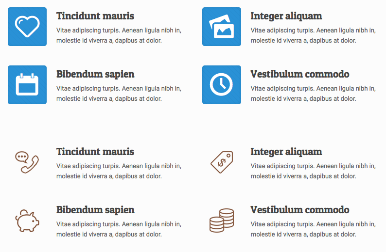
Create a features list with icons, links and colors on hover.
Lists are a great way to organize related sets of content in an interesting way. See the demo page for previews.
Tincidunt mauris
Vitae adipiscing turpis. Aenean ligula nibh in, molestie id viverra a, dapibus at dolor.Integer aliquam
Vitae adipiscing turpis. Aenean ligula nibh in, molestie id viverra a, dapibus at dolor.Malesuada fames
Vitae adipiscing turpis. Aenean ligula nibh in, molestie id viverra a, dapibus at dolor.
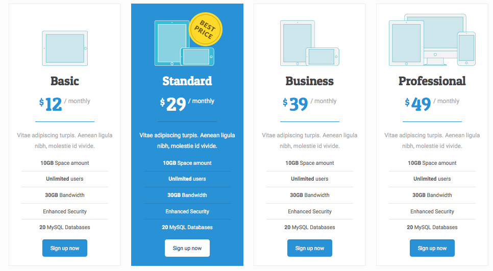
Display your pricing in an interesting way, choose from 3 different styles. Optional layouts include using boxes or also you can use them as table with or without labels. View the demo page for previews.
Add the CSS class pricing-box-featured to the column that you want to be featured. Like other columns you can choose the width of the pricing column by changing the CSS class on the column.

Basic
$12/ monthly
Vitae adipiscing turpis. Aenean ligula nibh, molestie id vivide.
- 10GB Space amount
- Unlimited users
- 30GB Bandwidth
- Enhanced Security
- 20 MySQL Databases

Standard
$29/ monthly
Vitae adipiscing turpis. Aenean ligula nibh, molestie id vivide.
- 10GB Space amount
- Unlimited users
- 30GB Bandwidth
- Enhanced Security
- 20 MySQL Databases

Business
$39/ monthly
Vitae adipiscing turpis. Aenean ligula nibh, molestie id vivide.
- 10GB Space amount
- Unlimited users
- 30GB Bandwidth
- Enhanced Security
- 20 MySQL Databases

Professional
$49/ monthly
Vitae adipiscing turpis. Aenean ligula nibh, molestie id vivide.
- 10GB Space amount
- Unlimited users
- 30GB Bandwidth
- Enhanced Security
- 20 MySQL Databases
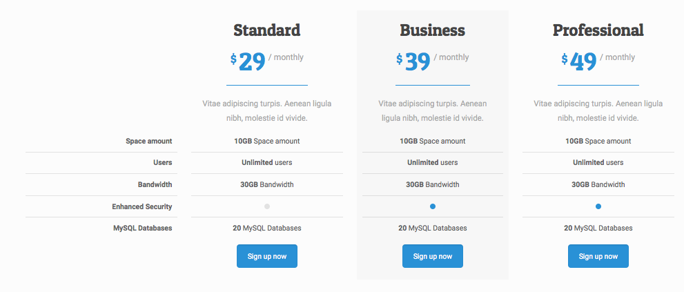
See below for example code to setup your pricing as a table. View the demo page for a preview.
Basic
$12/ monthly
Vitae adipiscing turpis. Aenean ligula nibh, molestie id vivide.
- Space amount
- Users
- Bandwidth
- Enhanced Security
- MySQL Databases
Standard
$29/ monthly
Vitae adipiscing turpis. Aenean ligula nibh, molestie id vivide.
- 10GB Space amount
- Unlimited users
- 30GB Bandwidth
- 20 MySQL Databases
Business
$39/ monthly
Vitae adipiscing turpis. Aenean ligula nibh, molestie id vivide.
- 10GB Space amount
- Unlimited users
- 30GB Bandwidth
- 20 MySQL Databases
Professional
$49/ monthly
Vitae adipiscing turpis. Aenean ligula nibh, molestie id vivide.
- 10GB Space amount
- Unlimited users
- 30GB Bandwidth
- 20 MySQL Databases
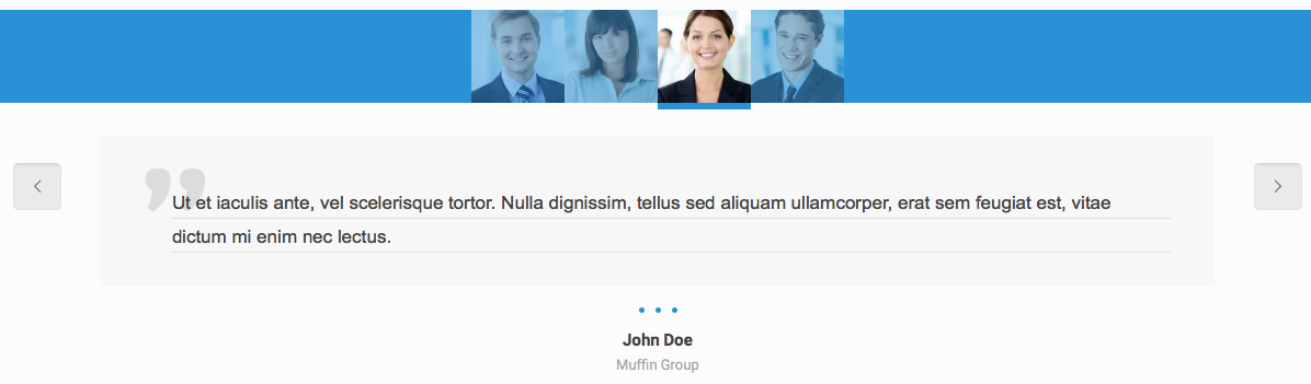
Content sliders are a great way to feature content in a slider. View demo page for a preview.
Offer sliders are a unique way to feature your content in a slider with vertical arrows and numbers. View the demo page for a preview.

Vitae adipiscing turpis. Aenean ligula nibh, mo lest ie id viverra a, dapibus at dolor. In iaculis viverra ne que, ac eleifend ante lobortis.
Additional features:
- Beautiful, full width slider.
- Simple menu with logo.
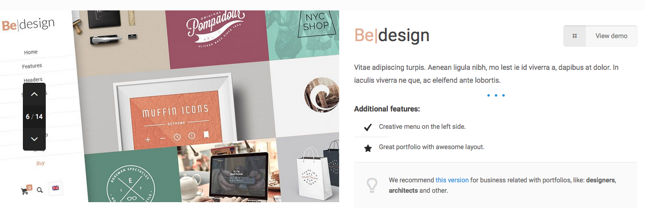
We recommend this version for business related with photos or images, like: photographers, hairdressers, artists and other.
Vitae adipiscing turpis. Aenean ligula nibh, mo lest ie id viverra a, dapibus at dolor. In iaculis viverra ne que, ac eleifend ante lobortis.
Nam malesuada:
- Donec blandit purus in euismod ullamcorper.
- Proin id varius felis.
Cum sociis natoque penatibus et magnis dis parturient montes, nascetur ridiculus mus. Aliquam ultricies dolor a purus varius.
Another great way to feature your content is the offer slider thumb style. View the demo page for a preview.

Perfect localization in the centre
with park nearbySuspendisse a pellentesque dui, non felis. Maecenas malesuada elit lectus felis, malesuada ultricies. Curabitur et ligula. Ut molestie a, ultricies porta urna.
Vestibulum commodo volutpat a, convallis ac, laoreet enim. Phasellus fermentum in, dolor. Pellentesque facilisis. Nulla imperdiet sit amet magna. Vestibulum dapibus, mauris nec malesuada fames ac turpis velit, rhoncus eu, luctus et interdum adipiscing wisi.
Aliquam erat ac ipsum. Integer aliquam purus. Quisque lorem tortor fringilla sed, vestibulum id, eleifend justo vel bibendum sapien massa ac turpis faucibus orci luctus non

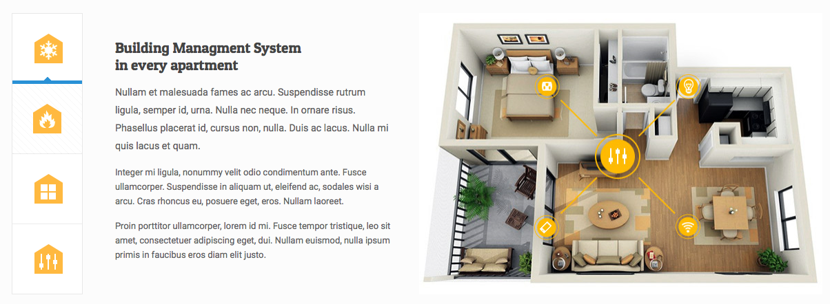
Building Managment System
in every apartmentNullam et malesuada fames ac arcu. Suspendisse rutrum ligula, semper id, urna. Nulla nec neque. In ornare risus. Phasellus placerat id, cursus non, nulla. Duis ac lacus. Nulla mi quis lacus et quam.
Integer mi ligula, nonummy velit odio condimentum ante. Fusce ullamcorper. Suspendisse in aliquam ut, eleifend ac, sodales wisi a arcu. Cras rhoncus eu, posuere eget, eros. Nullam laoreet.
Proin porttitor ullamcorper, lorem id mi. Fusce tempor tristique, leo sit amet, consectetuer adipiscing eget, dui. Nullam euismod, nulla ipsum primis in faucibus eros diam elit justo.

Air conditioner and
electrical heat systemDonec a nunc. Suspendisse est. Sed mauris ac lectus. Nullam augue pulvinar odio. Morbi tincidunt. Nulla facilisi. Morbi mauris lacus vestibulum vehicula
Nunc sit amet, consectetuer eget, ultricies iaculis et, posuere dui. Class aptent taciti sociosqu ad litora torquent per conubia nostra, per conubia nostra, per inceptos hymenaeos. Fusce nulla eu scelerisque tincidunt. Praesent odio eu dui sed felis cursus.
Maecenas nec tincidunt in, mollis aliquam, nulla luctus nulla nulla, egestas ipsum scelerisque vel, ipsum. Curabitur tempor. Quisque est ullamcorper lorem semper convallis.

Feel the warmth and relaxing
ambiance of fireplacePraesent in eleifend in, dapibus aliquam. Nunc erat erat eu sem pede sit amet dignissim turpis. Mauris at sapien eu pede bibendum tempus. Suspendisse fermentum molestie vitae, facilisis dignissim massa.
Cum sociis natoque penatibus et luctus et magnis dis parturient montes, nascetur ridiculus mus. Morbi urna viverra neque, vitae leo. Donec a nunc. Suspendisse est. Sed mauris ac lectus. Nullam augue pulvinar odio. Morbi tincidunt. Nulla facilisi. Morbi mauris lacus.
Maecenas nec tincidunt in, mollis aliquam, nulla luctus nulla nulla, egestas ipsum scelerisque vel, ipsum. Curabitur tempor. Quisque est ullamcorper lorem semper convallis.
Various content elements are included for you to organize the content on your website in creative ways. View the demo page to preview the options.
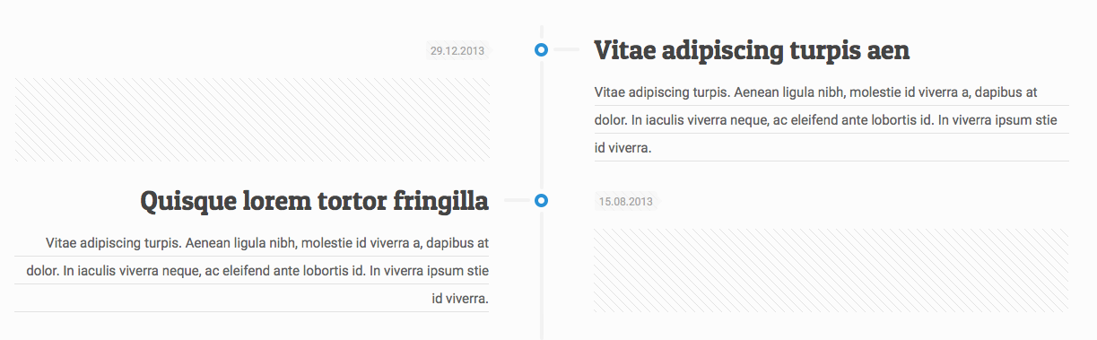
The Timeline element works is a great way to layout your time based (or any other) content in a vertical list.
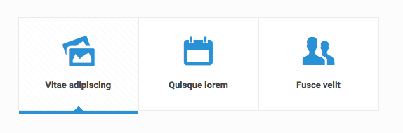
The Content link element makes a nice row of icons. Make sure to set your link and the icon:
Vitae adipiscing
Quisque lorem
Fusce velit
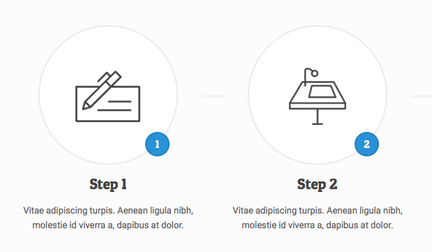
The How it works element allows you to create a nice steps section, which is super useful on landing pages.
1
Step 1
Vitae adipiscing turpis. Aenean ligula nibh, molestie id viverra a, dapibus at dolor.2
Step 2
Vitae adipiscing turpis. Aenean ligula nibh, molestie id viverra a, dapibus at dolor.Step 3
Vitae adipiscing turpis. Aenean ligula nibh, molestie id viverra a, dapibus at dolor.4
Step 4
Vitae adipiscing turpis. Aenean ligula nibh, molestie id viverra a, dapibus at dolor.
Icon and social bars can be created. Use the CSS class icon_bar_small to choose a small icon size.
Icon bar:
Social bar:
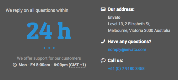
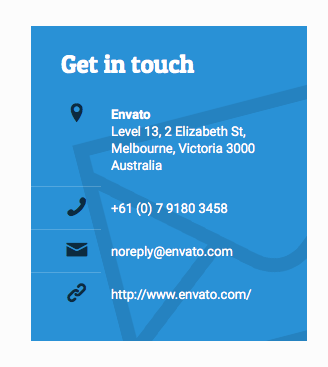
Creatively display your contact info, see the demo page for a preview.
Get in touch
- Envato
Level 13, 2 Elizabeth St,
Melbourne, Victoria 3000 Australia
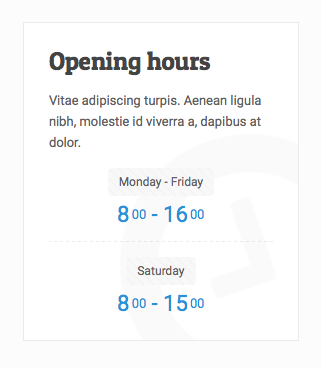
Creatively display your hours, see the demo page for a preview.
Opening hours
Vitae adipiscing turpis. Aenean ligula nibh, molestie id viverra a, dapibus at dolor.
- 800 - 1600
- 800 - 1500
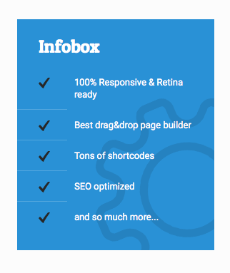
Creatively display any important information, see the demo page for a preview.
Infobox
- 100% Responsive & Retina ready
- Best drag&drop page builder
- Tons of shortcodes
- SEO optimized
- and so much more...
Note: In spring of 2018, we use iframes to embed google maps in some demos. Get your key here: https://developers.google.com/maps/documentation/javascript/get-api-key, replace the key in the iframe code with your own key.
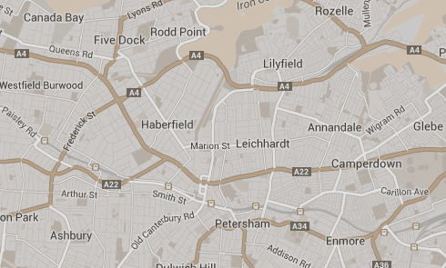
Add a map to your website. Add the latitude and longitude which you can get here. You can also set the zoom amount, height of the map.
Note: Google made changes to the API in June of 2016, see directions here of how to create your own API key.
Create your HTML:
Setup the map:
On the settings for your map you can choose an image for your pointer, change the color and saturation and more:
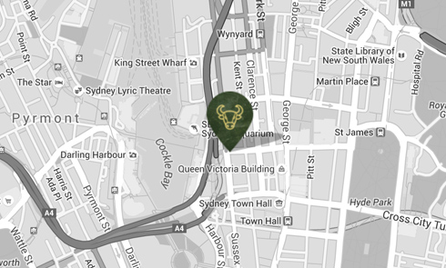
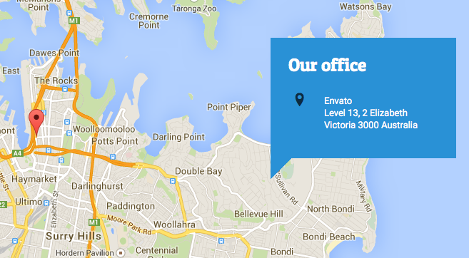
If you want to add a map with an address box use the code below. Make sure to set the latitude, longitude and zoom level.
Our office
- Envato
Level 13, 2 Elizabeth
Victoria 3000 Australia
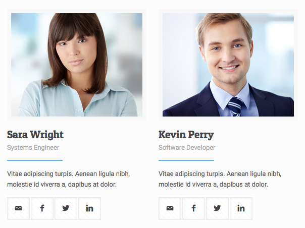
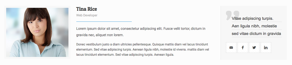
Team:
Team List:

Tina Rice
Web Developer
Lorem ipsum dolor sit amet, consectetur adipiscing elit. Fusce velit tortor, dictum in gravida nec, aliquet non lorem.
Donec vestibulum justo a diam ultricies pellentesque. Quisque mattis diam vel lacus tincidunt elementum. Sed vitae adipiscing turpis. Aenean ligula nibh, molestie id viverra. mattis diam vel lacus tincidunt elementum. Sed vitae adipiscing turpis. Aenean ligula.
A variety of styles are included to create Fancy Headings. View the demo page to view the options.
Morbi in sem quis dui placeratPraesent dapibus neque id
Praesent dapibus neque id
Morbi in sem quis dui placerat ornare. Pellentesque odio nisi, euismod in, pharetra a, ultricies in, diam.
Call to actions are a great way to draw attention to important information. Open a video or an image on click.
View the demo page for a preview.
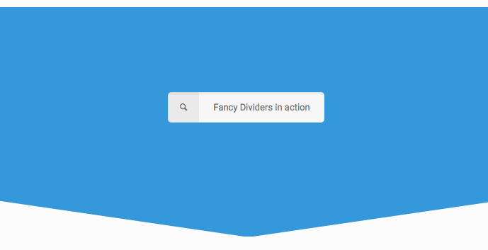
View the demo page for a preview. Also view the additional fancy divider options.
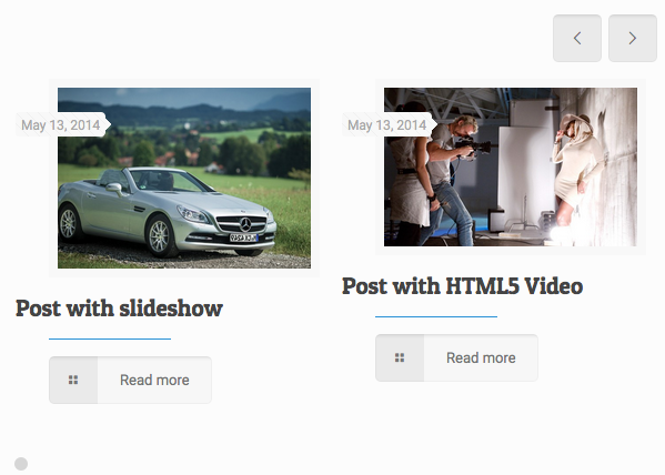
Loops are groups of content such as blog, product and portfolio items. View the demo page for a preview.
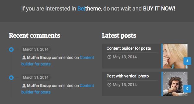
The Blog slider is a great way to display a group of your recent news stories.
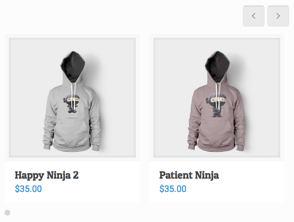
The Shop slider is a great way to display a group of your products.
Woo Logo
$35.00Ninja Silhouette
$35.00Happy Ninja 2
$35.00Patient Ninja
$35.00Ship Your Idea
$35.00$30.00–$35.00
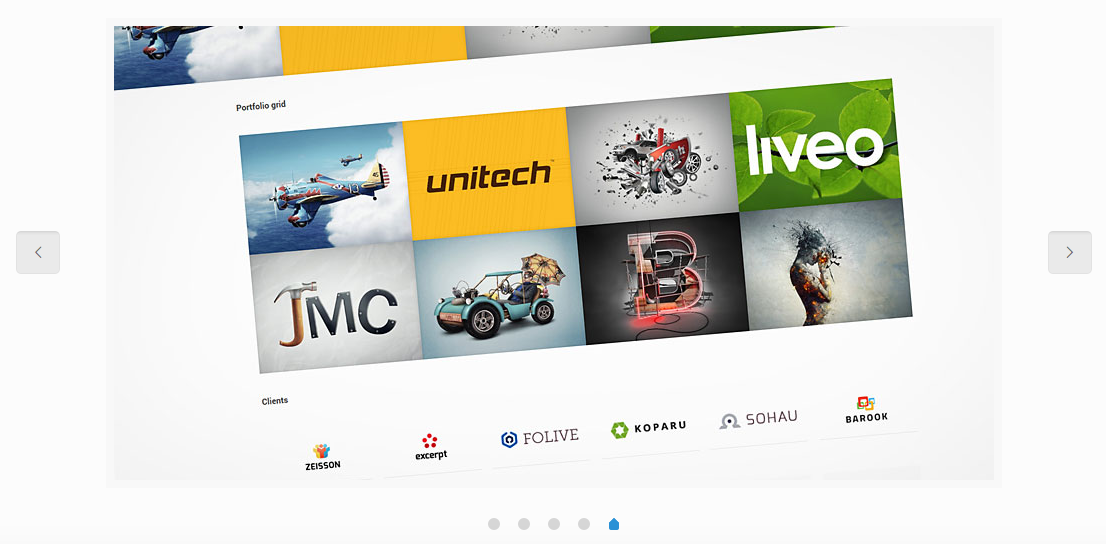
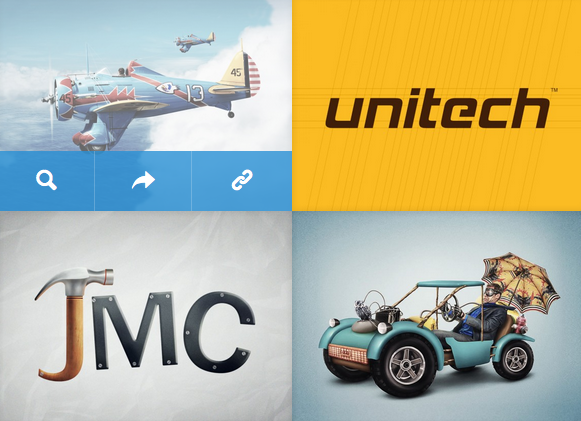
The Portfolio slider is a great way to display a group of your portfolio items.
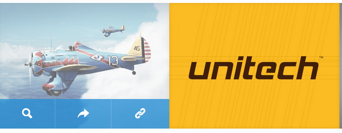
The Portfolio grid gives you an easy way to add portfolio items anywhere on your site.
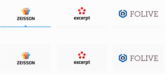
This item can create nice section with Clients.
You'll want to set your width for each item and choose either clients_default or clients_tiles.


Clients slider:
The powerful Revolution Slider has it's own documentation. Click here to view.

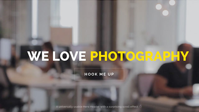
BeTheme includes 50+ prebuilt hero templates ready to use. These templates can be found in the root folder, the beginning of the file name all have "rev-s", for example "rev-s-premium-restaurant.html". If you sort your folder by file name you can easily find all of these templates. Click here to view live demos.
BeTheme includes the amazing WOWSlider which has over 30 amazing effects which can be used to create stunning image slideshows. Choose from boxed or fullscreen layouts and more. To view all available effect view live demos. Included in the main download folder are HTML files with the WOWSlider added, half use the fullscreen portfolio layout and half use the boxed simple template layout. You can use these to quickly build your page or you can copy the code to add it to a different page/template. These prebuilt pages have "wow-s" added to the start of the filename (example: wow-s-full-stack.html). Sort your folder by name to easily find these files.
WOWSliders have the option to have bullets or thumbs. To add one of these simply un-comment out the code in the HTML. On a boxed layout you must add the class "boxed-wow" and on a fullscreen layout you must add the class "fullscreen-wow". Example boxed layout slider with bullets turned on:
The CSS goes in the head of your document and the JS in the footer. To choose your effect you will change the name of the JS file in the footer.
The names of the effects which you can choose by changing the JS file are:
To customize the settings of the slider open the JS file for the effect you choose and scroll to the bottom, you will see the settings where you can set the timing, speed, choose random slide order and more.
/* ---------------------------------------------------------------------------
 * WOWslider Settings
 * -------------------------------------------------------------------------- */

jQuery("#wowslider-container1").wowSlider( {
    effect:"cube",
	duration:20*100, // change effect transition time
	delay:20*100, // change delay on each slide
	width:1000,
	height:450,
	autoPlay:true, // autoplay slides on load
	playPause:false, // show a play & pause button
	stopOnHover:false,
	loop:false,
	bullets:0,
	caption:false, // use a caption on slides
	controls:false, // use left, right arrows
	fullScreen:true, // show a fullscreen button

	responsive:1,
	gestures:2,

	// remove next 3 lines to remove "random" slide order
	onBeforeStep:function(i, c) {
        return (i+1 + Math.floor((c-1)*Math.random()))
    }
}

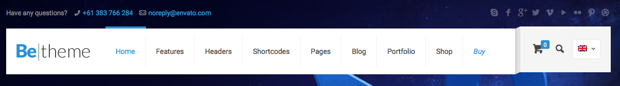
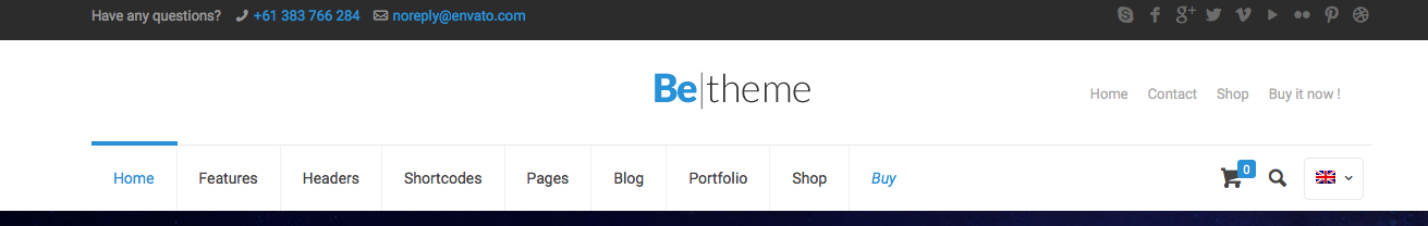
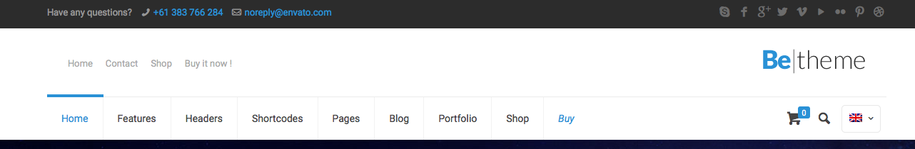
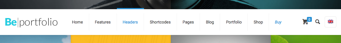
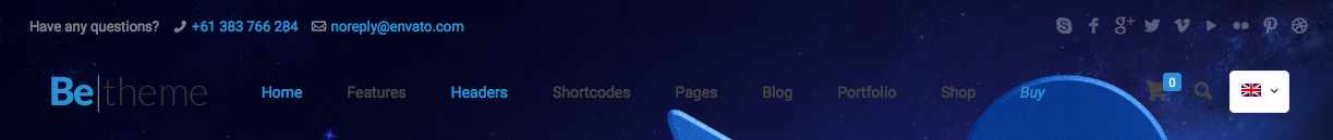
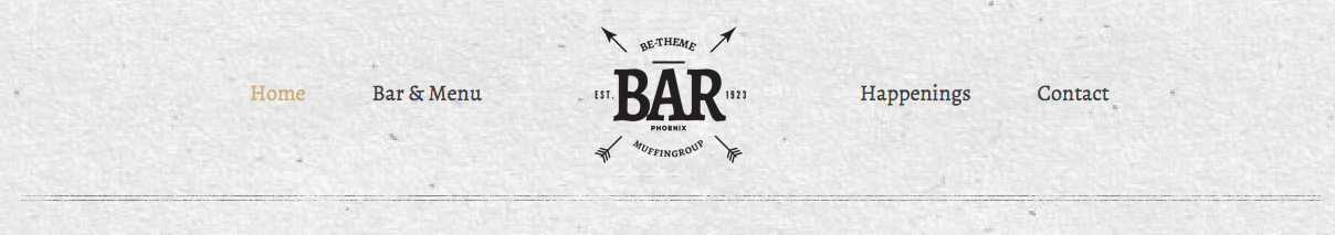
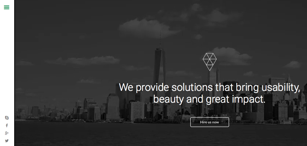
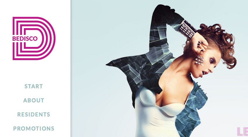
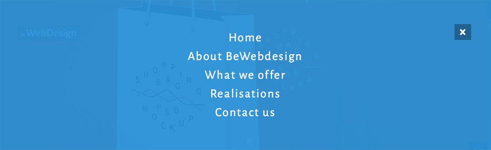
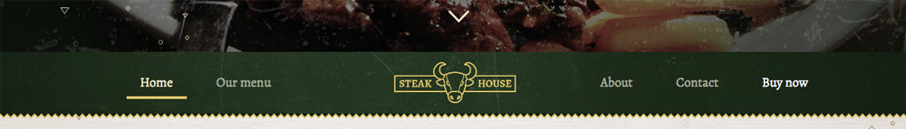
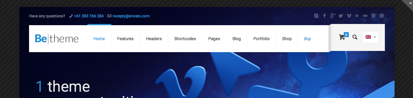
There are a lot of header options and layouts for you to choose from. See directions and examples below. Click the images to view larger sizes or click the demo links for live examples.
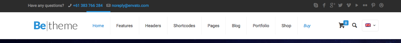
Sticky Header - Add the CSS class sticky-header to the body tag on your page.
Minimalist Header - (this option removes background image from inner pages and also reduce header height) Add the CSS class minimalist-header to the body tag on your page.
For a Modern header layout add the CSS class header-modern to the body tag on your page.
For a Classic header layout add the CSS class header-classic to the body tag on your page.
For a Stack: Left header layout add the CSS classes header-stack and header-left to the body tag on your page.

For a Stack: Center header layout add the CSS classes header-stack and header-center to the body tag on your page.
For a Stack: Right header layout add the CSS classes header-stack and header-right to the body tag on your page.
For a Magazine header layout add the CSS classes header-stack and header-magazine to the body tag on your page.
For a Fixed header layout add the CSS class header-fixed to the body tag on your page.

For a Below slider header layout add the CSS class header-below to the body tag on your page. You also need to position your header below your slider in your html code.
For a Transparent header layout add the CSS class header-transparent to the body tag on your page.
For a Simple header layout add the CSS class header-simple to the body tag on your page.

For a Split header layout add the CSS class header-split to the body tag on your page.
For a Creative header layout add the CSS class header-creative to the body tag on your page.
For a Creative: Always Open header layout add the CSS classes header-creative and header-open to the body tag on your page.
For an Empty header layout add the CSS classes header-empty and header-simple to the body tag on your page.
For an Overlay header layout add the CSS classes header-overlay and header-transparent to the body tag on your page.
For a Plain header layout add the CSS class header-plain to the body tag on your page.

For a Below Slider Split header layout add the CSS classes header-below header-split sticky-header to the body tag on your page.
For a Creative Right header layout add the CSS classes header-creative header-rtl to the body tag on your page.

For a Creative Right Always Open header layout add the CSS classes header-creative header-open header-rtl to the body tag on your page.

For a Split Menu Semitransparent layout add the CSS classes header-split header-semi to the body tag on your page.
For a boxed page layout add the CSS class layout-boxed-width to the body tag on your page.
For a 960px grid layout add the CSS class grid960 to the body tag on your page.
To choose one of the preset color choices link to one of the stylesheets located in the CSS > Skins folder. Put this link in your header after the main stylesheet to make sure it over-rides the main styles.
If you choose a custom Google Font you will need to make sure to add the font to your CSS. First find your font on the Google Font website, copy the font you want to import and paste that into the head of your website.
Add to the head:
Then add to your CSS:
.example_class { font-family:'Pompiere',Arial,Tahoma,sans-serif }
BeTheme HTML has a large variety of pre-made layouts. The main homepages are located in the root (main) folder of the template and the interior pages and content are located within the content folder. You can either leave the files here or move them to the root of the website if you prefer (make sure to edit the paths of items if you move them to avoid broken links).
In the head section of your web pages you can set the title tag and description tags, which help search engines index your page. It's also a good idea to add specific alt tags to images.
Enter your page title here 

If you have questions or need help please start a post on our support forum.

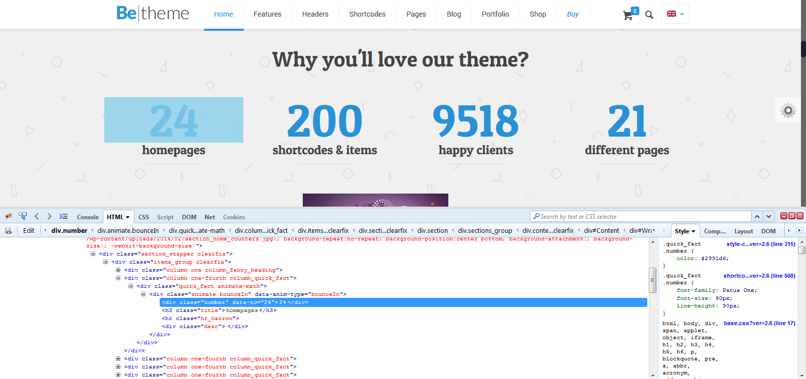
If you are trying to make customizations to your website you may need to target a specific element with CSS. Luckily there are free browser tools available to make this easy, directions below.
If you're using Google Chrome you can inspect the element that you need to change by right clicking on the element and choosing "Inspect element". After that you'll see the details of the element.
On the left side there is a list of styles used for each class/id. If you want to change something, you can edit it on the screen and see how the elements look after the changes. If everything is good and you want to make the same changes on your site copy right the styles from the box on the right side, for example:
#weekly-features .inner-border {
    height: 80px;
    padding: 20px;
}
and paste this code into your custom.css CSS file to over-ride the default theme styles.

If you prefer the Firefox browser you can use the Firebug for Firefox plugin. In contrast to Google Chrome, Firebug must be installed at first before you can use it. To do so please click Firefox in the left top corner > Add-ons and then search for Firebug and install it. When you get it into your browser you can use it the same way as with Google Chrome but instead of clicking "Inspect element" click "Inspect element with Firebug".
On the left side there is a list of styles used for each class/id. If you want to change anything you can edit it on the screen and check what the elements look like. If everything is good and you want to make the same changes on your site copy right the styles from the box on the right side, for example:
#weekly-features .inner-border {
     height: 80px;
    padding: 20px;
}
and paste this code into your custom.css CSS file to over-ride the default theme styles.
If you need advanced customizations or would prefer to hire a developer to save time we recommend checking out Envato Studio where there are a lot of great developers who would be happy to help!

If you are looking for a web host for your new website we recommend checking out Bluehost.


 1
1 2
2 3
3 4
4 5
5 6
6 7
7 8
8 9
9 10
10 11
11 12
12 13
13